
Every Surescripts dashboard spoke its own visual language. The same number could read differently from one dashboard to the next, and that matters when every chart has to answer a clinical question.
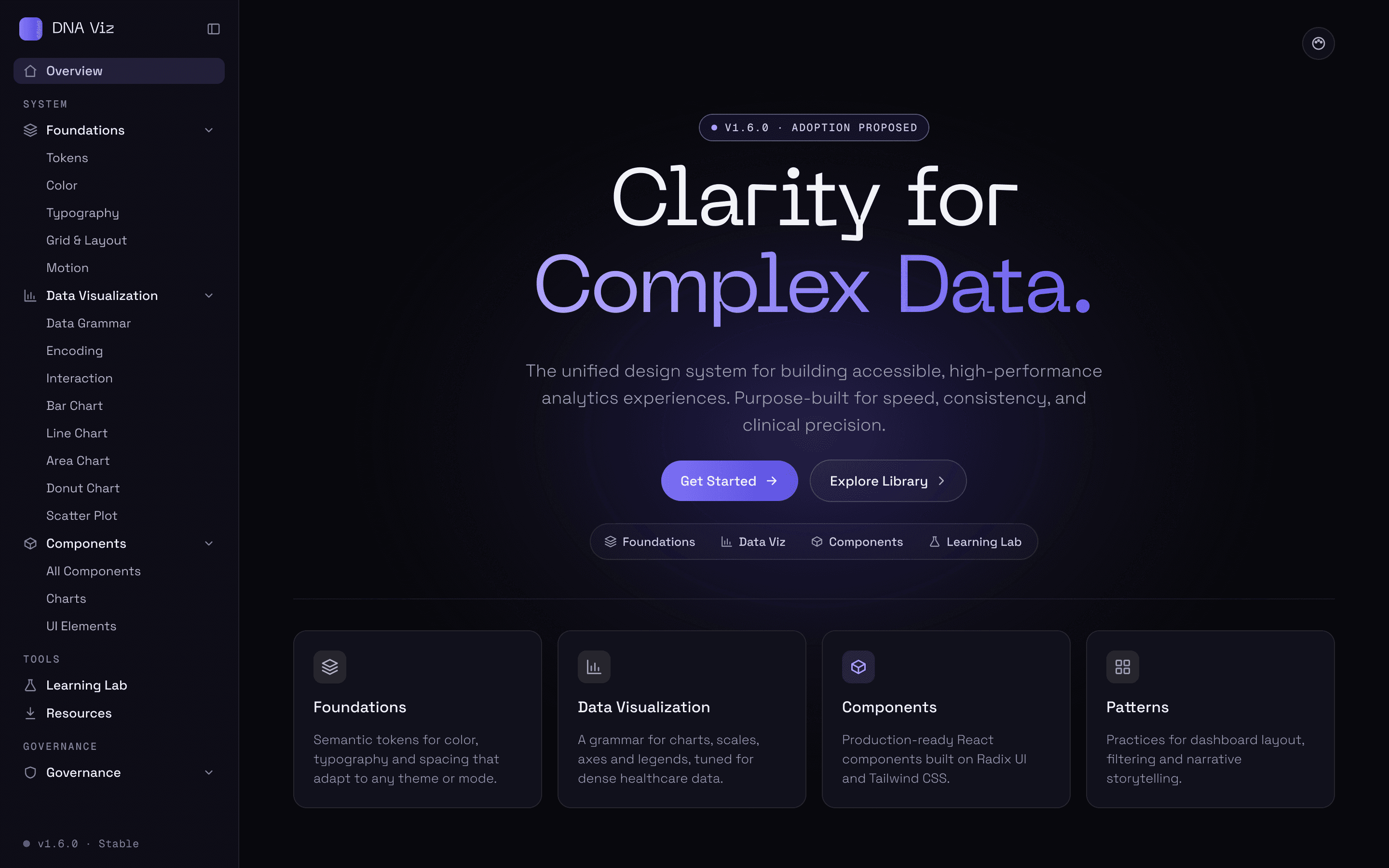
DNA Viz is the design system I built to fix that. It gives every dashboard one set of tokens and chart rules, so a number reads the same wherever it shows up. I designed and built it end to end, on my own.
The documentation site, on its dark surface.
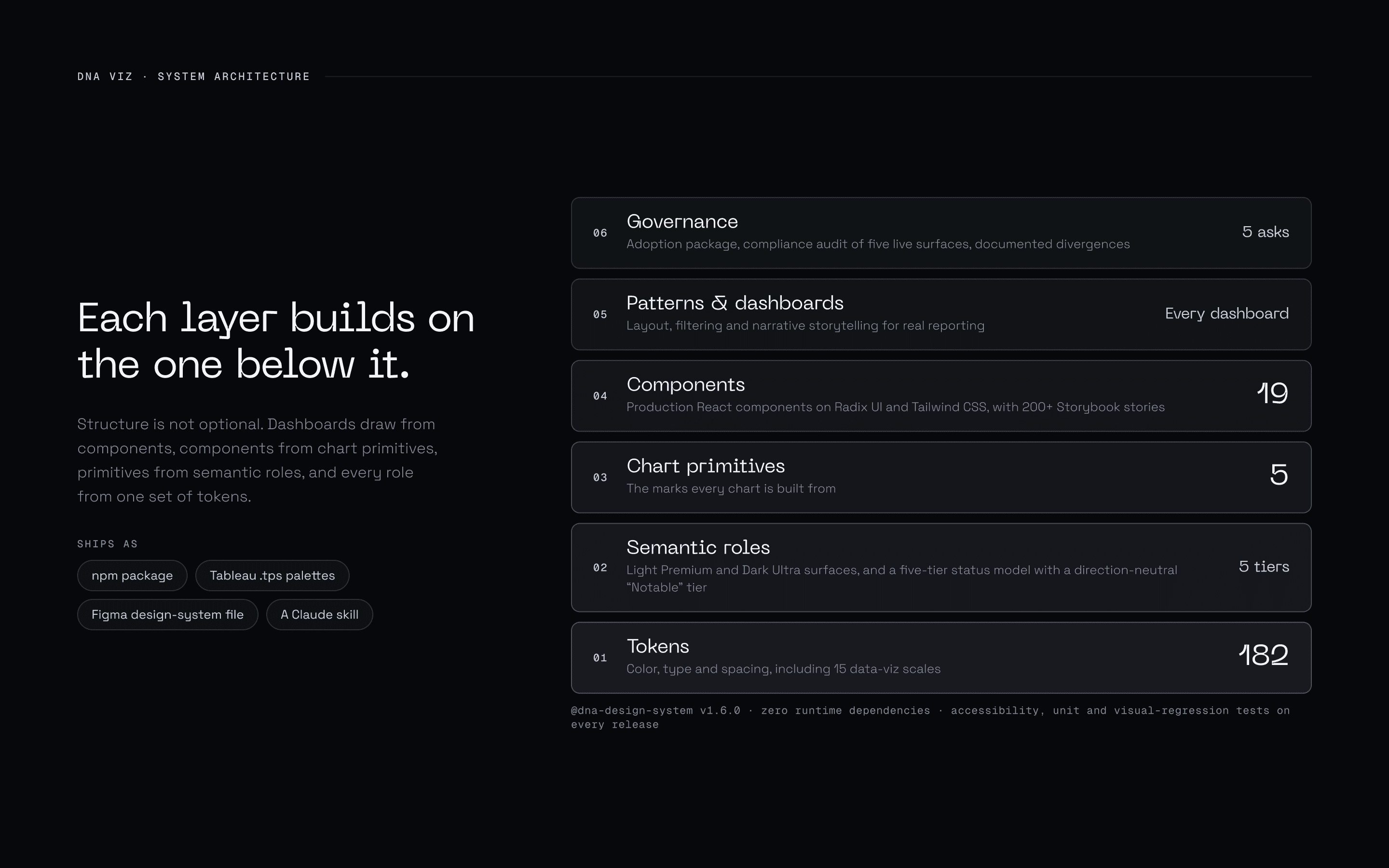
Six layers, one direction
Tokens sit at the bottom and governance at the top, and no layer reaches past the one beneath it. Change a token once and the change carries all the way up, from 182 tokens to the dashboards built on them.
Colour carries meaning, and the question picks the chart
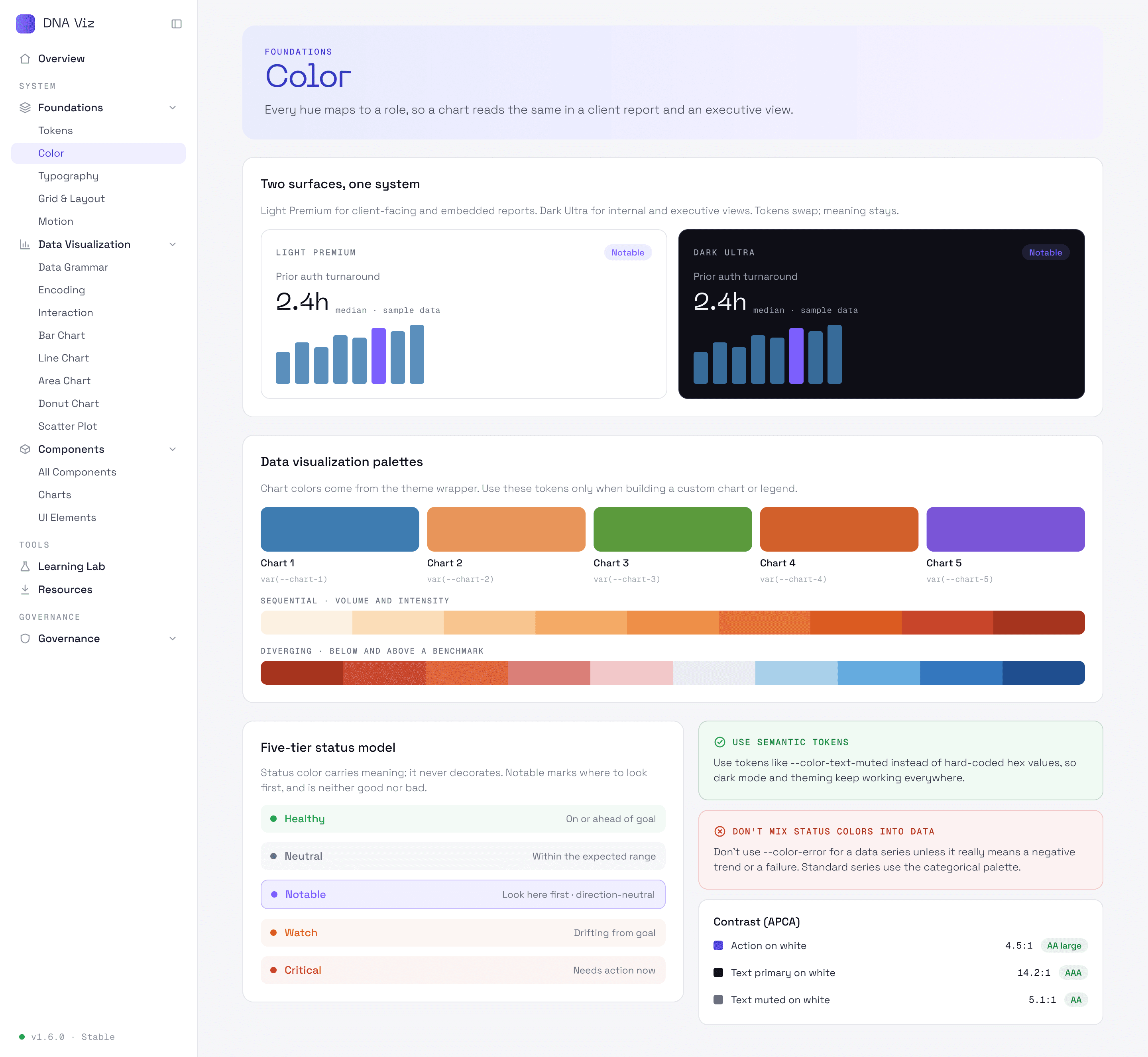
Colour is never decoration. The status scale runs from Healthy to Critical and adds a neutral Notable tier, for a change that’s worth a look but isn’t good or bad. Charts are chosen by the question they answer, not by the shape of the data.
Built in React, taught in a playground
19 production components ship as one package, 5 of them charts. The Learning Lab lets anyone try a chart before building with it.
Put to work
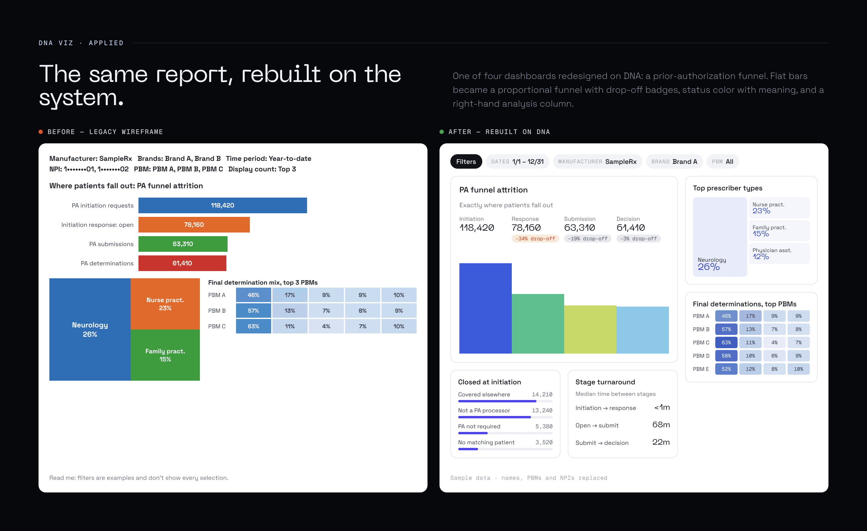
Four Surescripts dashboards were redesigned on DNA. The prior-authorization funnel shows the before and after.
Where it stands
DNA is at v1.6.0, and its adoption has been proposed to the enterprise UX team. It’s built in React and Recharts, with Tableau palettes and a Figma library alongside.
About these screens
The screens on this site are rebuilt with sample data.
From the case study