

I've been thinking a lot lately about how rigid Tableau can feel when you're used to the flexibility of Figma. So, I gave myself a challenge: build a modular, component-driven Tableau dashboard template in under three hours—with minimal Figma involvement.
This wasn't for a client or stakeholder. Just a sandbox build to test layout flexibility, responsiveness, and dashboard design flow directly in Tableau.
Check out my dashboard here!
Sidebar First: Building the Skeleton
I began with the sidebar—a classic layout move—but pushed it a bit further using Tableau's parameter controls. I added a collapsed variant with a sticky hover background, giving it more of a modern app-like feel.

| 10 minutes in
Initial sidebar scaffold built – starting with a clean vertical layout and minimal UI.
Icons were added for structure, though they weren’t natively built in Figma—just pulled from a Figma-friendly pack. The real takeaway here was realizing how modular even a simple sidebar could become with just parameters and layout containers.

| 42 minutes in
Initial sidebar styles added and components built - next test, responsivity!
Table Structure & Header Design
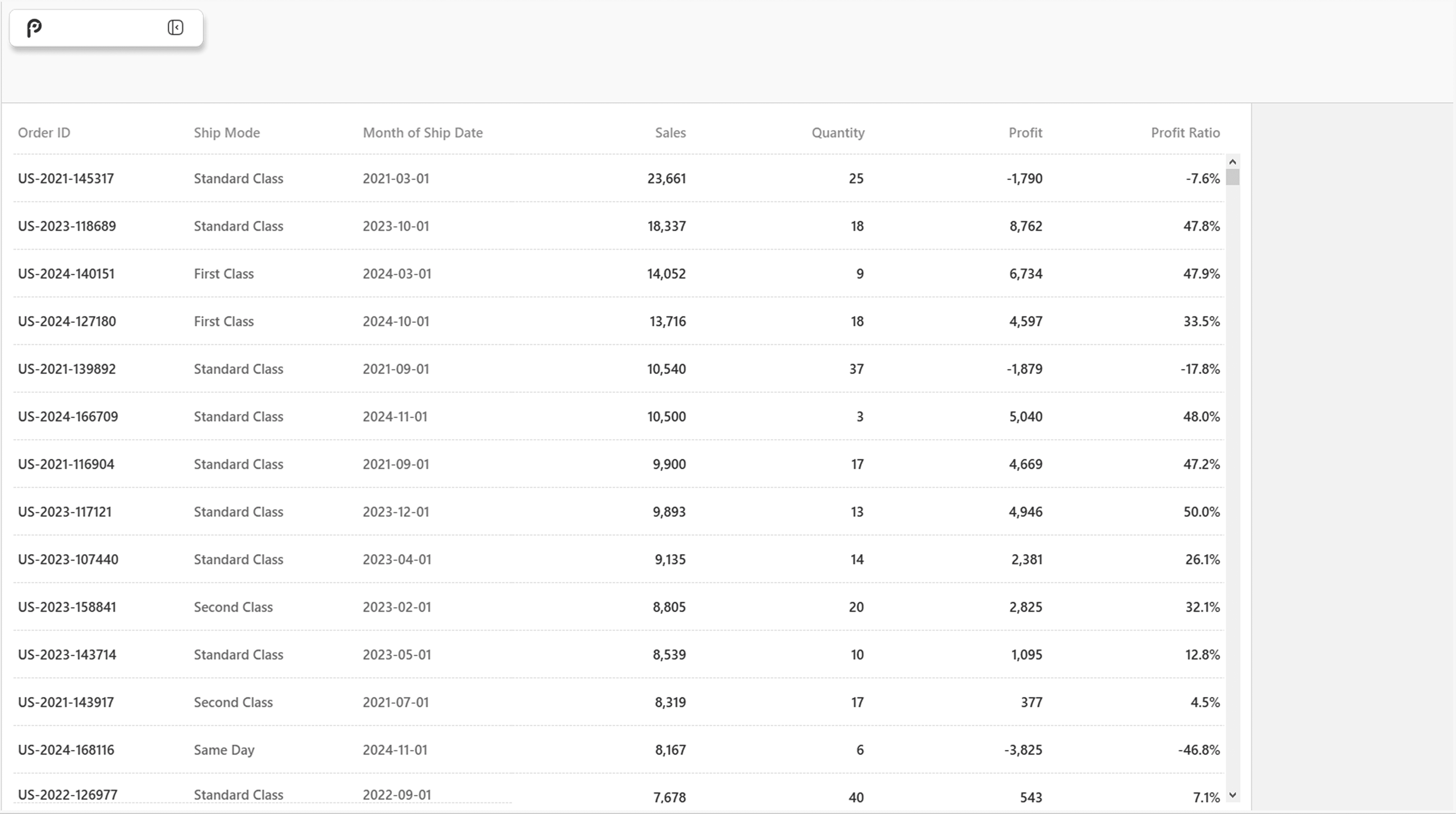
From there, I added a simple data table built with Tableau’s Sample Superstore dataset. While this table is basic, it grounded the layout and gave me room to test real-world responsiveness, spacing, and text hierarchy.
The header section came next—simple, clean, and positioned to eventually support filters, toggles, and user-specific actions.

| 45 minutes in
Responsive sidebar *mostly* working - I'm almost an hour in at this point so I continue pushing forward.
| 60 minutes in
Basic nav item styling added – preparing for sticky behavior and sidebar refinement.

| 1 hour 25 minutes in
Sticky Nav bar did NOT work - all good! Let's redirect to the basics.
Tableau vs. Figma: Working with Both
This sprint reminded me of Tableau’s strengths and its limitations.
I did use a few assets from Figma—icons and layout references—but wanted to focus on Tableau-native construction. Compared to Figma, Tableau lacks design freedom, but its parameter actions and layout containers can mimic a design system mindset if you approach it with structure.
Where It’s Going
This prototype is just the start. My next steps:
Build advanced filters and parameter-driven actions
Expand for tablet and mobile sizing
Release two template paths:
Tableau-focused: square, block-based, no frills
Figma-polished: rounded edges, shadows, slick UI
The long-term goal: create a full modular design system for Tableau dashboards—clean, scalable, and reusable across use cases.
Inspirations
Wrike
They have a surprisingly clean UI System with a plethora of advanced components.
Figma’s UI system
Figma's Design System speaks for itself, its functional and minimal and clean.
Google Material Design
SO MUCH to choose from, their documentation is incredible and they have a massive library with full documentation to use.
Each of these systems balances power and approachability—something I want to bake into my dashboard templates as they evolve.
Final Thoughts
This was never about building a finished product—it was a three-hour design and UX stress test. But even in that short time, the concept of component-driven analytics became a lot more real.
More to come. For now, you can follow the build at:
A VERY CLEAN DASHBOARD TEMPLATE!
or
Check out my website!
CHECK OUT THE FINAL STAGES

| 1 hour and 50 minutes in
Building out the beginnings of a "Help Center" to help users navigate the dashboard once it's built.

| 2 hours and 30 minutes in
Initial build for the filters panel - will check back later.
| 20 hours and 40 minutes in
Testing the dashboard for mobile and tablet - did not realize it was so different or tricky…