

Lacrosse 26 is a lacrosse video game. Before you could play a match, its menus asked you to work out the controls: which card was selected, and which button moved you forward. You were solving the interface before you got to the sport.
Audit before redesign
I didn't start by drawing new screens. I reviewed every screen in the original game and mapped every button press, then logged what I found as ten numbered issues, each ranked by how badly it got in the way. The audit also recorded what already worked, so the redesign wouldn't throw it out.
That audit became the brief. Each design decision in the redesign points back to an issue it fixes.
Always show where you are
The clearest problem was Team Select. The original never showed which card you were on. In the redesign the highlight always sits on the thing you're changing, and it lands in under a fifth of a second, so moving the stick feels direct.
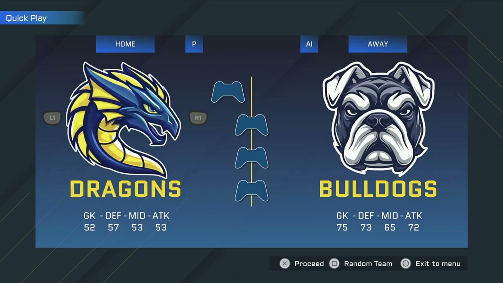
Before: the original Team Select. Nothing tells you which card is selected.
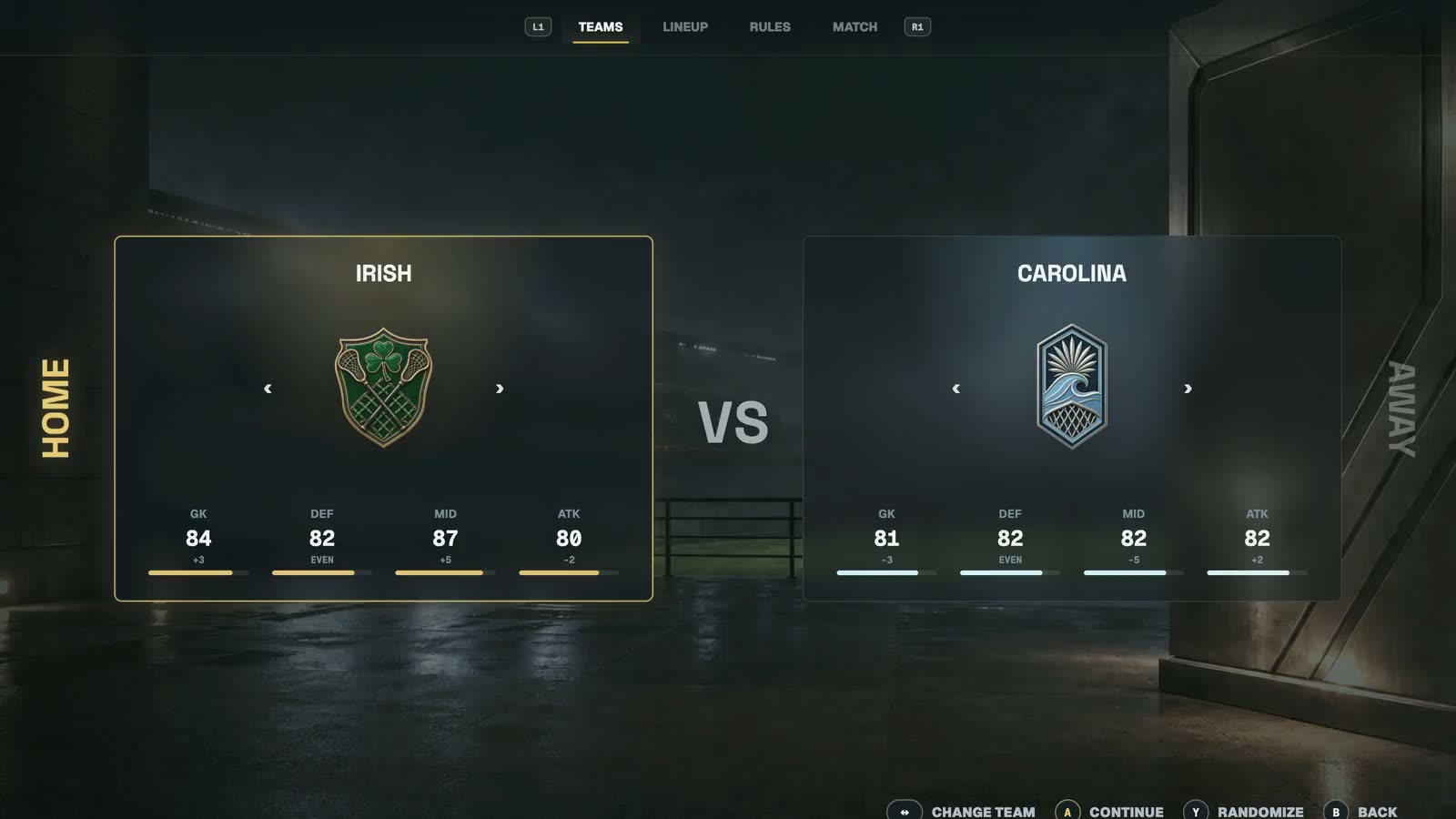
After: the highlight is always on what you're changing.
The same rule runs through every screen. You move and select the same way everywhere, and the next button is always on screen.
Put the lineup on the field
The original Starting 10 was a plain list of names. Lacrosse players think in positions, so the redesign places each player where they play on the field. The highlight moves across the field, and options appear only when you can use them.

Starting 10, set on the field instead of in a list.
Clear rules for what’s selected
Most of the screen stays neutral. Bright colour only marks what’s selected and what to press. Highlights respond in under 0.2 seconds and panels settle in about 0.3, so feedback is fast and transitions stay calm. It works with a keyboard or a game controller and respects reduced-motion settings, and accessibility is written into each screen’s spec rather than added later.
Where it stands
Quick Play v3 is the approved design, and it's ready to hand off for estimation. It isn't proven in production yet. Testing on a real controller, from couch distance, is still ahead, and I'd rather say that plainly than call it finished.
The full walkthrough, with before-and-after screens you can swipe through, is in the case study.
From the case study