Energy Dashboard
Tableau showed the load, not what to move

Pierre Byrne Designs

At the end of 2024 I built an energy dashboard concept on Tableau Public: a district's use split into factory, corporate and residential, with a city illustration in the middle. It reported the load well enough. It couldn't say what to do about it.
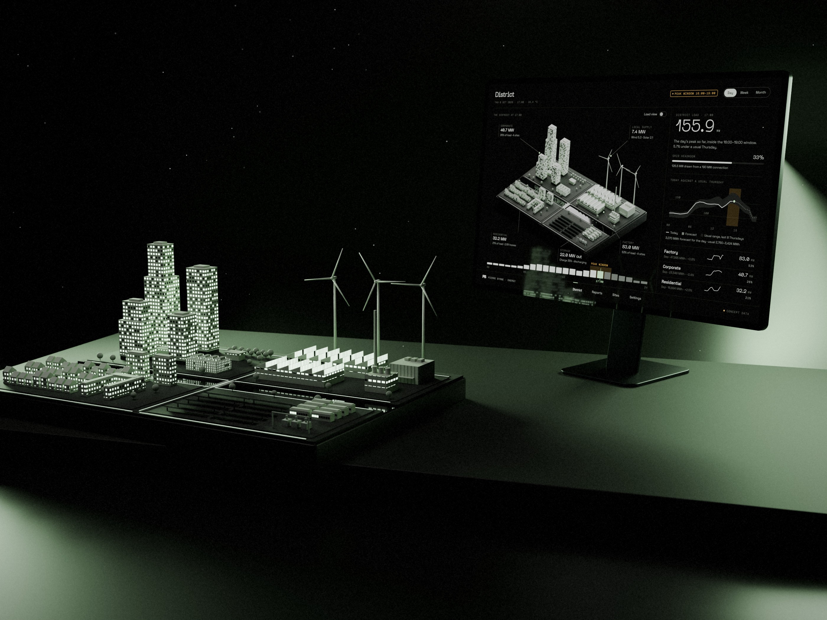
Version 2 keeps the palette, near-black with a sage accent, and rebuilds the rest as a web app around one question: what should change before tonight's peak?
Where Tableau stopped
The recommendations in version 1 were placeholder text, and a few Superstore leftovers were still in the filters. "Detail" had no view behind it. The ranges on the cards didn't add up either: the three sectors' highs came to 103K MWh, but the Total card read 92–212K. The city was a still image, so it looked the same at 3 a.m. as at the evening peak. I couldn't credit the illustration's source, so it stays in version 1.

The district is the map
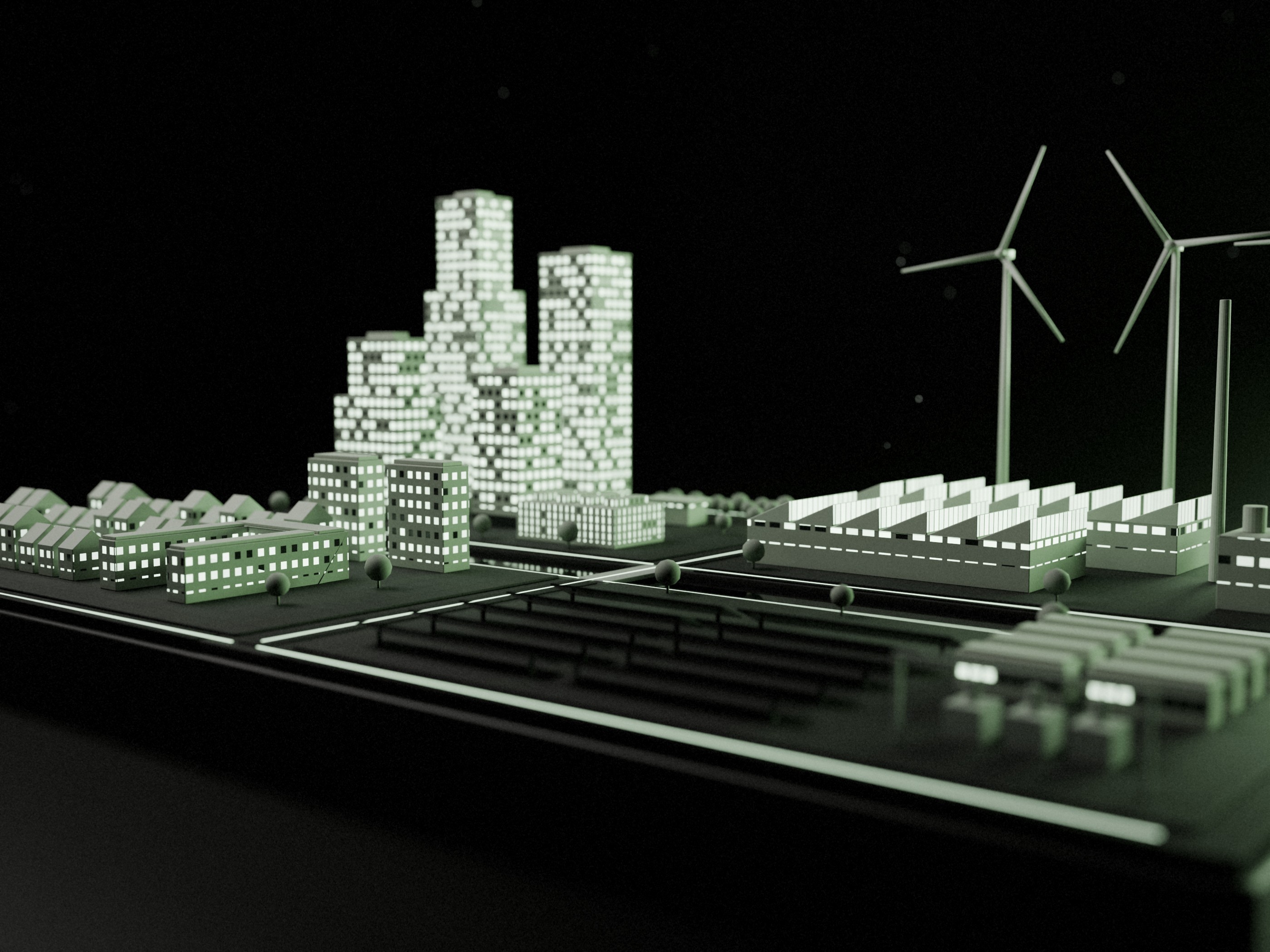
In its place is an original model of an energy district, built in Blender: a campus, a factory, terraced homes, solar, storage and three turbines, split by a canal. In version 2 the model does work. Each lit window is a share of its sector's load, and selecting a zone opens its sites. A Load view raises each zone by its consumption, and the factory becomes the skyline.
One dataset behind every number
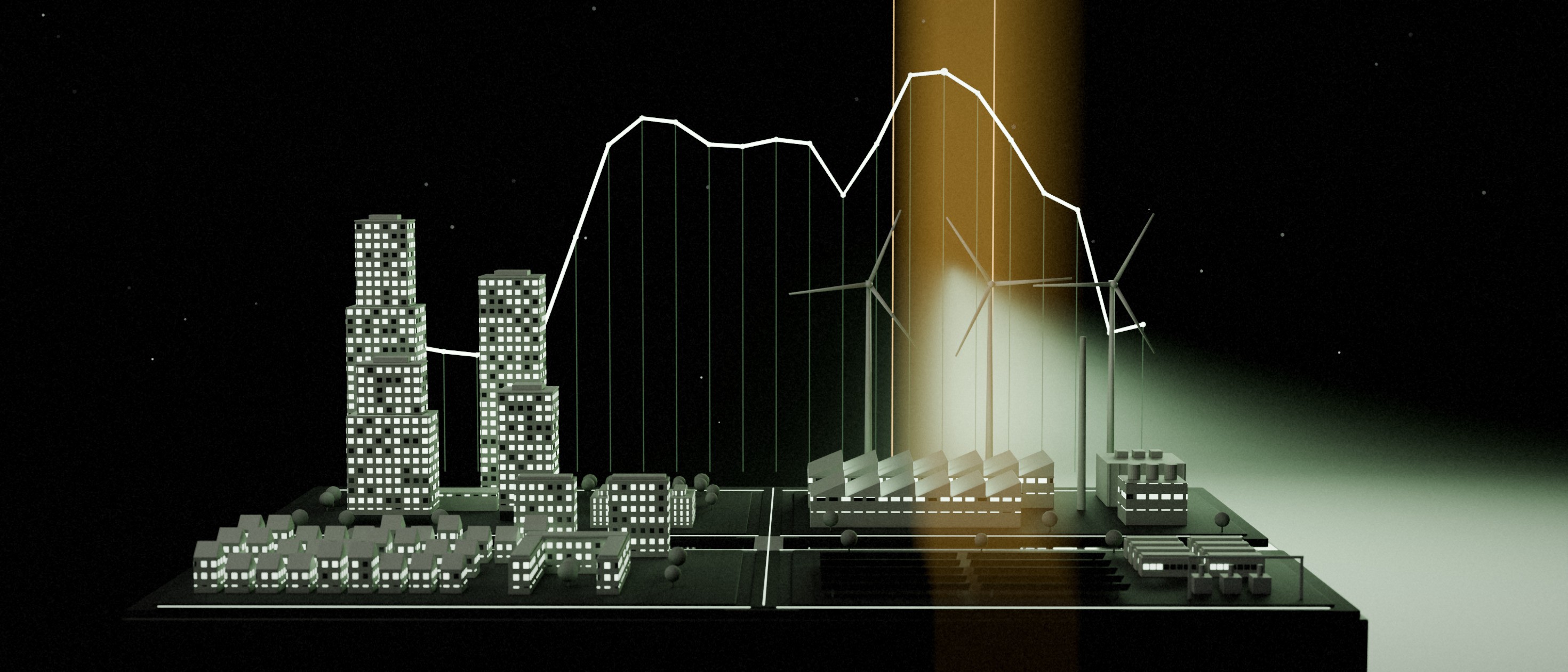
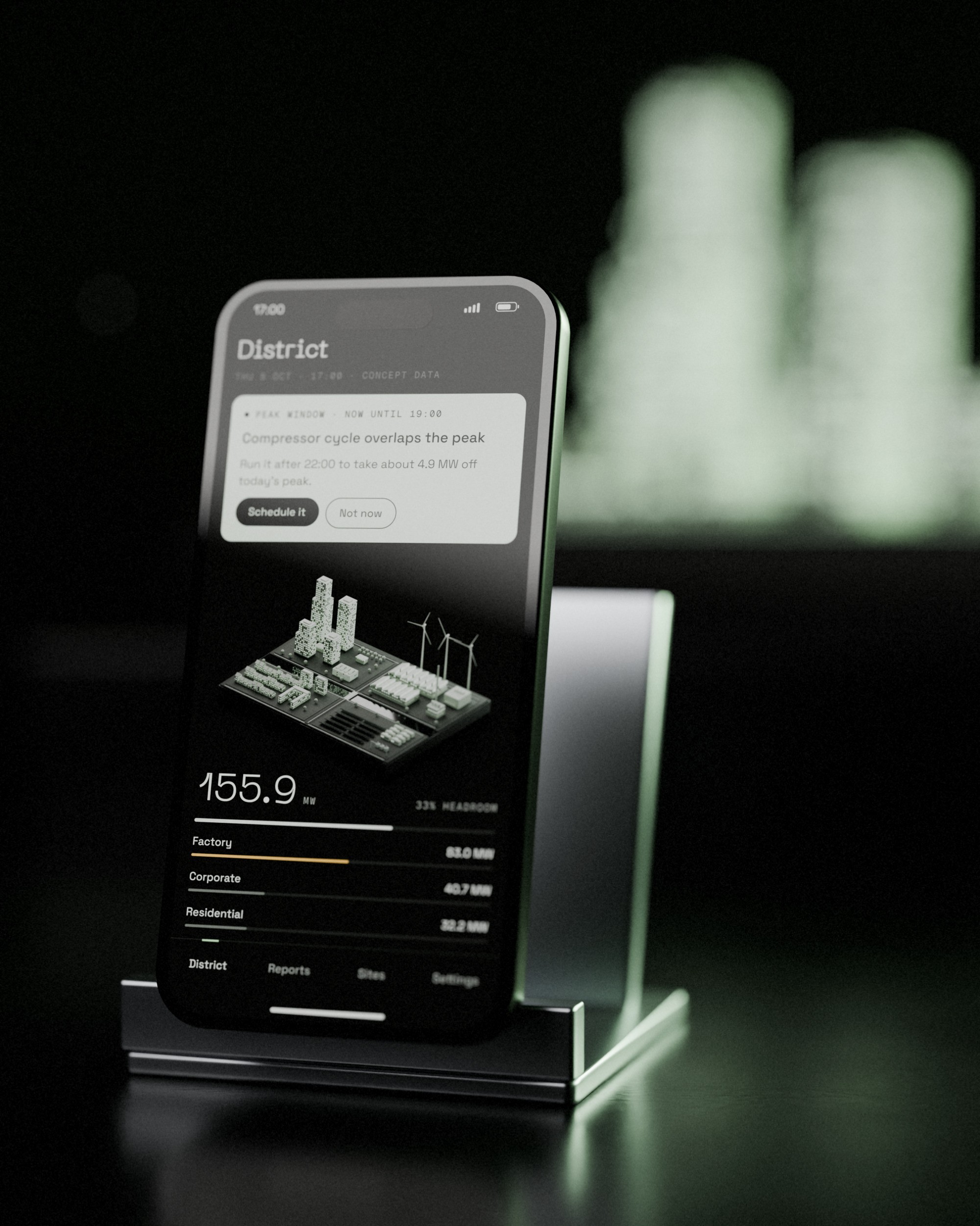
Every figure comes from a single seeded simulation, sized to version 1's highest months. Totals add up, peaks match across screens, and the recommendations are calculated rather than written. On the screens, the district peaks at 155.9 MW at 17:00, inside a 16:00–19:00 peak window.
Reports that answer something
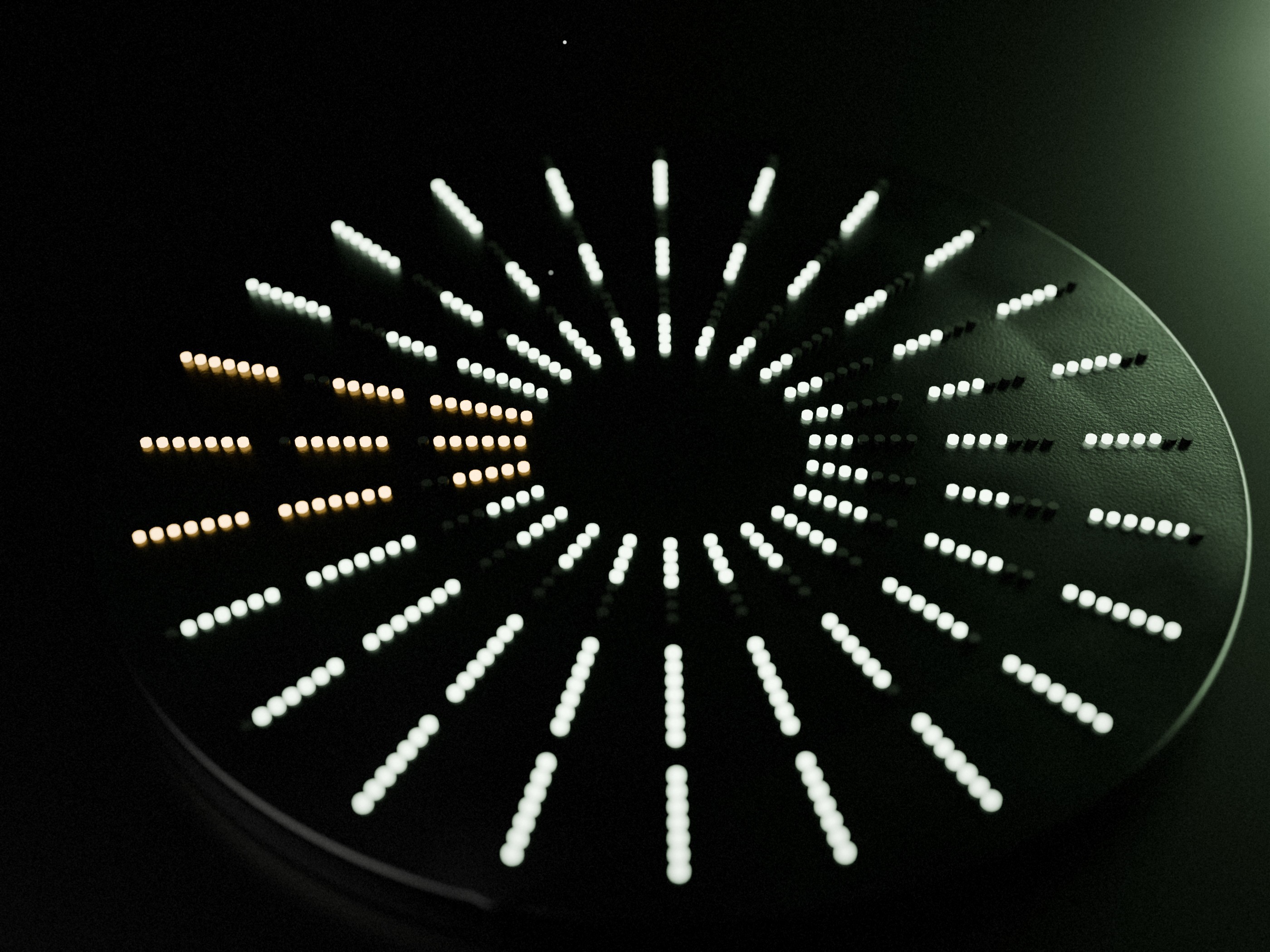
Reports shows two years by sector, today's source mix and a 24-hour load clock. The clock is version 1's radial dot chart, its most original chart, now with a meaning: each spoke is an hour.

The view version 1 never had
Site detail shows one site's day against its usual range, its peak window and what to do about it. The compressor house runs a cycle from 16:00 to 19:00, right on the district's peak. Moving it to the night shift takes about 4.9 MW off that peak.

Settings that matter
Settings in version 1 was two rows of empty swatches. In version 2 those rows hold three themes, Mint, Graphite and Paper, all from one set of tokens. They also hold three ways to draw the district: lit windows, the Load view or a flat site plan.

The peak, on a phone
On a phone, the dashboard leads with the alert: the peak is coming, and here's the one action that moves it. The district and its three sectors sit underneath.
About the data
Everything in version 2 is concept data from a seeded simulation of a fictional district. Nothing is measured. Version 1's layout was inspired by Zajno's "Smart Energy Dashboard Concept" on Dribbble, and version 1 is still on Tableau Public.
Version 2 is designed in Figma for desktop and phone. It isn't a live app yet.
The Energy Dashboard is one of a pair with My Top Dogs, another Tableau dashboard I've rebuilt as a web app.
From the case study